

24 Exterior House Colors Ideas for a Beautiful Home
The right exterior color can completely change how a home looks from the street, making the architecture feel more welcoming, refined, modern, or timeless. Whether you are refreshing a traditional property, updating a small cottage, or giving a contemporary home a stronger visual identity, choosing from the right exterior house colors ideas can make the entire property feel more cohesive. Exterior paint also works together with the roof, front door, trim, windows, landscaping, driveway, and surrounding environment, so the best color is rarely chosen in isolation. From warm whites and sophisticated grays to earthy greens, coastal blues, and dramatic charcoal shades, these exterior house color combinations offer practical inspiration for different architectural styles. Each idea focuses on a specific palette and explains how to use it effectively so your home’s exterior looks balanced rather than overly busy.
1. Classic Warm White With Black Trim
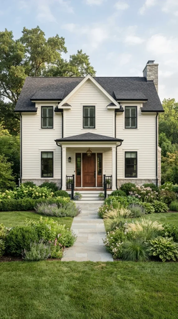
A warm white exterior creates a timeless foundation that works beautifully on traditional, farmhouse, Colonial, and transitional homes. Unlike stark pure white, a creamy or slightly warm white has enough softness to complement natural surroundings without making the façade appear overly bright. Pairing it with black window frames, shutters, gutters, or porch details introduces crisp contrast and gives the property a polished architectural appearance. A natural wood front door can soften the monochromatic scheme while adding warmth. This exterior house color combination is especially effective when the roof is charcoal, black, or medium gray. Keep landscaping relatively organic with green shrubs, ornamental grasses, and restrained flowering plants so the clean color palette remains the main visual feature.
2. Soft Gray With Crisp White Trim
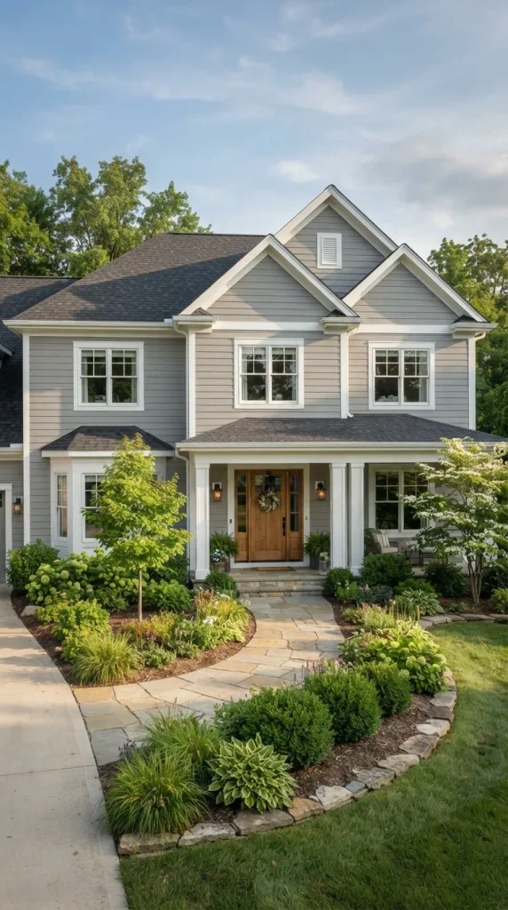
Soft gray remains one of the most versatile choices for homeowners who want a sophisticated exterior without committing to a very dark shade. A light-to-medium gray siding color provides subtle dimension while white trim around windows, doors, rooflines, and porch columns keeps the façade fresh. This palette suits ranch houses, contemporary cottages, traditional homes, and many suburban architectural styles. For additional warmth, consider a stained wood front door in walnut, oak, or medium brown. A darker gray roof can create a layered tonal effect, while stone accents add natural texture. When selecting the exact gray, examine samples outside because daylight can reveal blue, green, or beige undertones that may not be obvious indoors.
3. Sage Green With Natural Wood Accents

Sage green offers an earthy exterior color choice that blends naturally with gardens, mature trees, and landscaped properties. Its muted character makes it especially attractive for cottages, farmhouses, Craftsman homes, and homes surrounded by greenery. Use a soft sage on the main siding and pair it with warm white or creamy trim to keep the façade light. Natural wood can become the secondary accent through the front door, porch ceiling, garage door, or exposed beams. A medium-brown roof complements the organic palette particularly well. Sage green is also useful when you want the house to feel connected to its surroundings rather than visually dominating the landscape, making it a practical option for wooded or garden-rich properties.
4. Charcoal Gray With Warm Wood
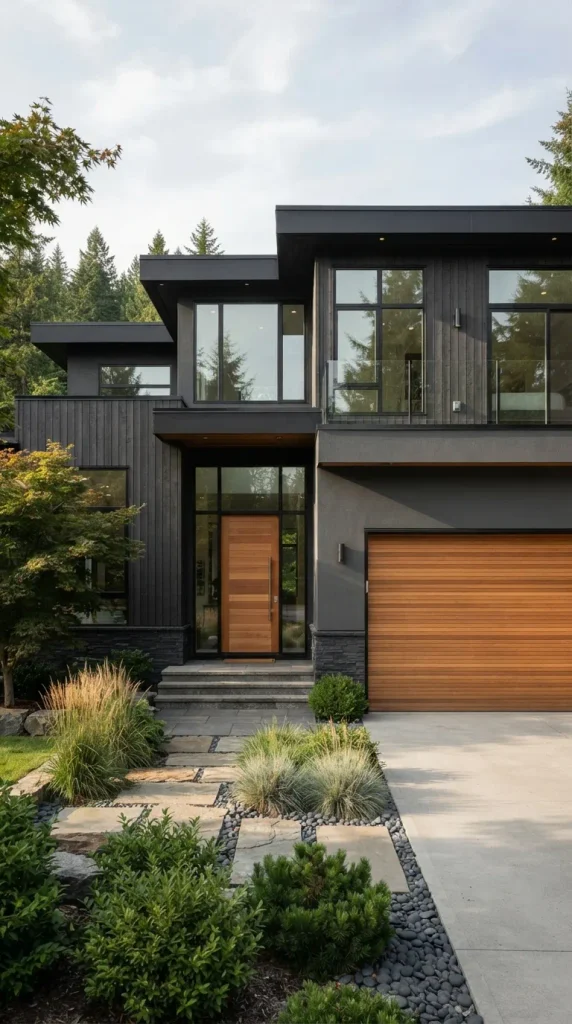
Charcoal gray creates a dramatic, modern exterior while remaining more versatile than pure black. It works particularly well on contemporary houses, modern farmhouses, minimalist properties, and homes with strong geometric architecture. Instead of using several contrasting colors, allow the deep gray to serve as the dominant exterior shade and introduce warmth through a natural wood front door or garage door. Softly colored stone, concrete, or warm metal fixtures can complete the palette. White trim is optional; on a contemporary home, keeping trim close to the charcoal shade produces a more streamlined appearance. Because dark paint absorbs more sunlight and can visually emphasize architectural mass, balance it with generous windows, lighter landscaping, or warm wood details.
5. Navy Blue With White Architectural Details

Navy blue provides a refined alternative to black or charcoal and works beautifully when you want a bold exterior without losing traditional character. A deep navy façade looks especially appealing with bright white trim around windows, columns, dormers, and porch railings. The contrast highlights architectural details and gives the home a crisp coastal or New England-inspired appearance. A natural wood or stained mahogany door can prevent the palette from feeling too cool. Navy pairs naturally with gray roofing, cedar accents, and simple green landscaping. Before painting the entire house, test the color on several walls because deep blues can look significantly different in direct sunlight, shade, and evening conditions.
6. Creamy Beige With Dark Brown Trim
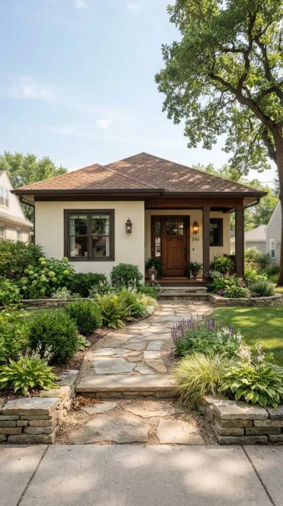
Creamy beige creates a warm, inviting exterior that works particularly well with traditional, Mediterranean-inspired, ranch, and transitional homes. Unlike cooler gray-beige shades, a warm cream with subtle sandy undertones can make the property feel established and welcoming. Dark brown trim around windows, doors, and garage openings adds definition without the sharper contrast of black. Terracotta planters, natural stone pathways, and warm wood details reinforce the earthy character. This palette is particularly attractive in sunny climates because the creamy base reflects light while maintaining enough warmth to avoid looking stark. For a cohesive result, select roofing and masonry materials with related brown, tan, or muted neutral undertones.
7. Muted Blue-Gray With White Trim
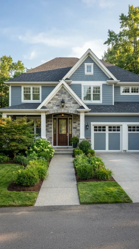
Blue-gray offers the visual calm of blue with the sophisticated neutrality of gray, making it one of the most adaptable exterior house colors for contemporary and traditional homes. A muted version works especially well when you want color but prefer an understated appearance. White trim can frame the windows and roofline, while a deep navy or natural wood front door provides a controlled focal point. This combination looks attractive beside both cool stone and warm brick, giving homeowners flexibility when working with existing materials. Blue-gray can also make a home feel visually lighter, particularly when paired with white porch columns, pale landscaping stones, and simple green shrubs.
8. Earthy Olive Green With Cream Trim
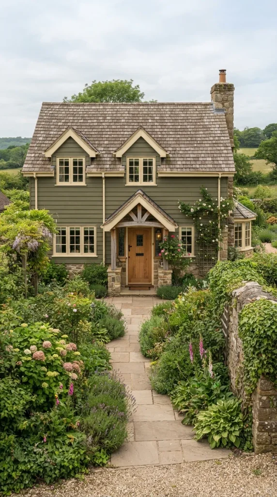
Olive green brings deeper, more sophisticated character to a home’s exterior while maintaining an organic connection with the landscape. Its muted yellow-green undertone works beautifully with cream, beige, warm white, and natural wood. Rather than choosing an intensely saturated green, select an earthy olive that changes subtly throughout the day. Cream-colored trim can highlight windows and architectural lines without creating excessive contrast. A wood door, copper-toned light fixtures, and stone walkway can further enhance the natural palette. This exterior color idea is especially suitable for Craftsman, cottage, farmhouse, and rustic homes where materials such as stone, timber, and greenery are already prominent.
9. White Brick With Natural Wood Door
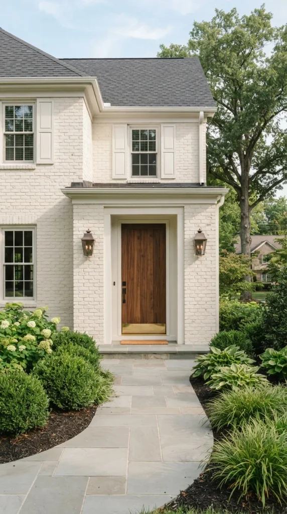
Painting brick white can dramatically brighten an exterior while preserving the texture and character of the masonry. A soft white rather than an icy bright white generally creates a more welcoming appearance, especially when combined with a natural wood front door. Warm timber tones introduce visual depth and prevent the façade from appearing flat. Black or bronze hardware can provide subtle definition around the entrance without overwhelming the simple palette. This approach works particularly well for traditional brick homes, cottages, ranch houses, and updated Colonial properties. When choosing white brick paint, consider the existing roof, stonework, and permanent materials because their undertones should harmonize with the selected white rather than compete against it.
10. Greige With Black Accents
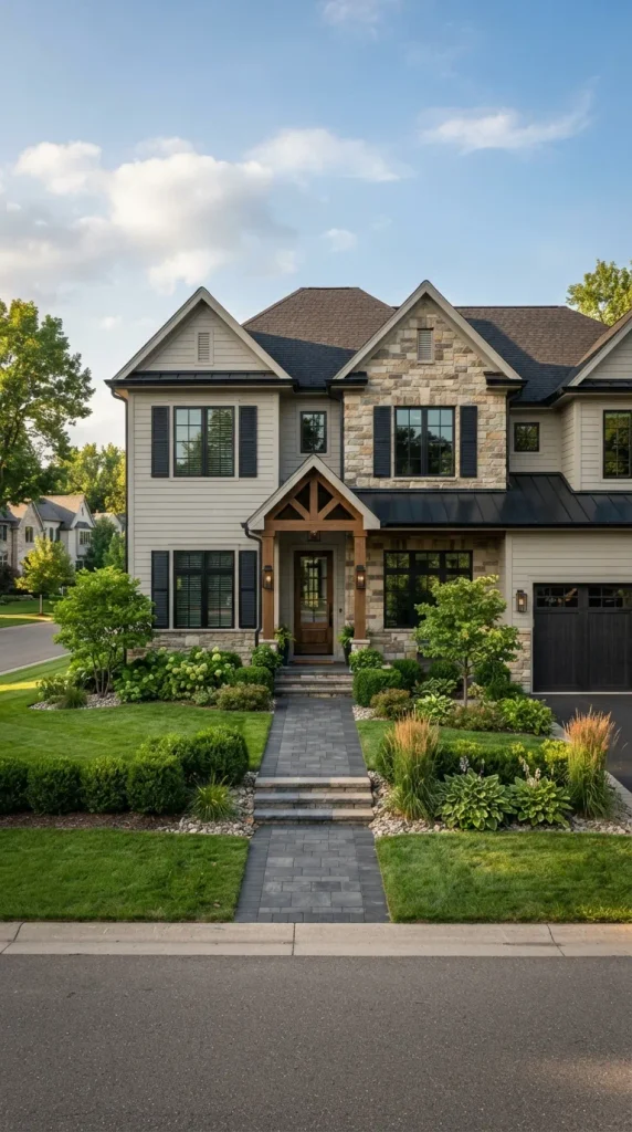
Greige, a balanced mixture of gray and beige, is useful for homeowners who want a neutral exterior that feels neither too cool nor overly warm. It can adapt to many architectural styles and is particularly effective on transitional homes where traditional and contemporary details meet. Use greige across the primary siding, then introduce black through shutters, window frames, lighting fixtures, railings, or the front door. The result has enough contrast to appear defined without relying on multiple colors. Greige also works well beside natural stone, brick, and wood, making it a practical choice for homes with mixed exterior materials. Test the color against both morning and afternoon light to understand its undertones.
11. Dusty Blue With Natural Stone
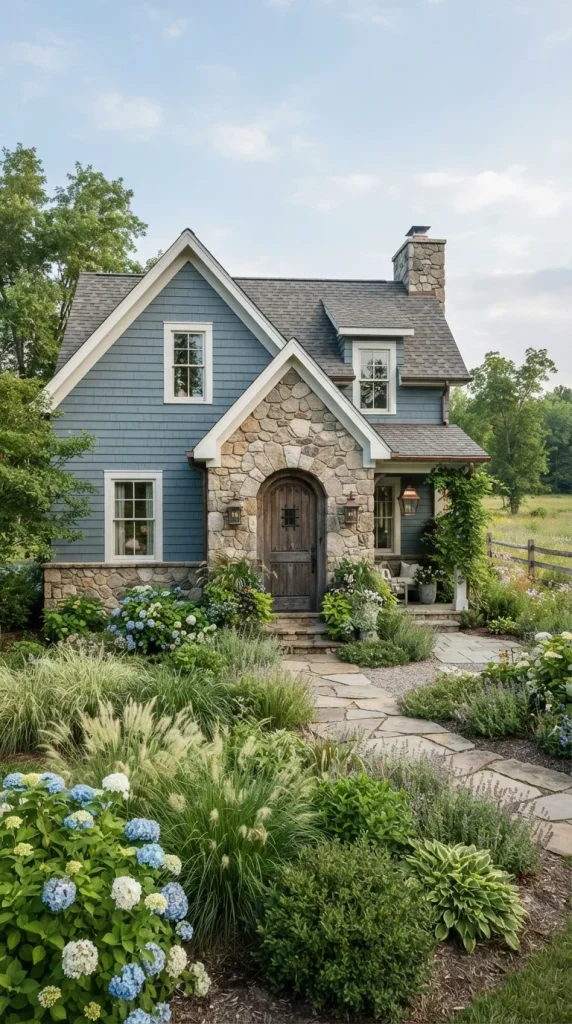
Dusty blue creates a relaxed exterior that feels particularly attractive in coastal, cottage, and country settings. Its subdued saturation keeps the color sophisticated rather than overly playful, while natural stone introduces texture and earthy variation. A soft white or pale gray trim color can frame windows and doors, allowing the blue to remain the visual anchor. Use weathered wood or medium-brown timber for the front door to connect the cool wall color with warmer natural materials. This combination works especially well when landscaping includes ornamental grasses, hydrangeas, evergreen shrubs, or other soft greenery. The overall effect is calm and welcoming while still giving the home recognizable personality.
12. Warm Taupe With White Trim

Warm taupe is a reliable choice when you want a sophisticated neutral that has more character than beige. Its subtle brown-gray undertones allow it to work with stone, brick, wood, and a wide range of roofing materials. White trim around windows, doors, and porch details creates enough contrast to define the home’s architecture. A dark bronze or deep brown front door can reinforce the warmth of the palette. Taupe is especially effective on larger homes because it provides visual softness without becoming too pale or stark. For landscaping, use layered greenery and natural stone rather than highly saturated decorative colors, allowing the exterior to maintain a calm, cohesive appearance.
13. Forest Green With Natural Stone Accents

Forest green makes a confident statement while remaining deeply connected to natural surroundings. On a home surrounded by mature trees or a lush garden, a rich green exterior can visually integrate the structure with the landscape. Because the color is intense, balance it with lighter natural stone, warm cream trim, or a wood entrance door. The palette is particularly appropriate for Craftsman, rustic, lodge-inspired, and traditional homes with substantial architectural detailing. Use forest green selectively if the property receives limited sunlight, as deep shades can appear considerably darker in heavy shade. Bronze or aged-metal lighting fixtures can provide an elegant finishing touch without introducing an unrelated accent color.
14. Terracotta With Creamy White Details

Terracotta brings warmth and Mediterranean character to an exterior, particularly when paired with creamy white rather than bright white. The earthy orange-brown hue works beautifully with clay roof tiles, textured stucco, natural stone, and timber accents. Cream around windows, doors, columns, and architectural trim helps balance the warmth and prevents the exterior from becoming visually heavy. This palette can also suit Southwestern or Spanish-inspired homes when supported by appropriate architectural materials. Keep landscaping natural with olive trees, grasses, drought-tolerant plants, or simple greenery where appropriate. Because terracotta changes significantly in sunlight, sample several shades outdoors before choosing one for the complete façade.
15. Light Blue With Bright White Trim

A pale blue exterior can make a home feel airy, fresh, and approachable, particularly when combined with crisp white trim. This palette is a natural fit for coastal cottages, traditional homes, Cape Cod-inspired architecture, and relaxed suburban properties. White window surrounds, porch railings, columns, and fascia emphasize the home’s structure and create a clean contrast against the blue. A natural wood door can add warmth without disrupting the light palette, while a gray roof keeps the overall scheme balanced. Light blue works especially well with simple landscaping because the exterior already provides a gentle color statement. Choose a blue with muted undertones if you want an elegant appearance rather than a highly saturated coastal look.
16. Black Exterior With Warm Wood
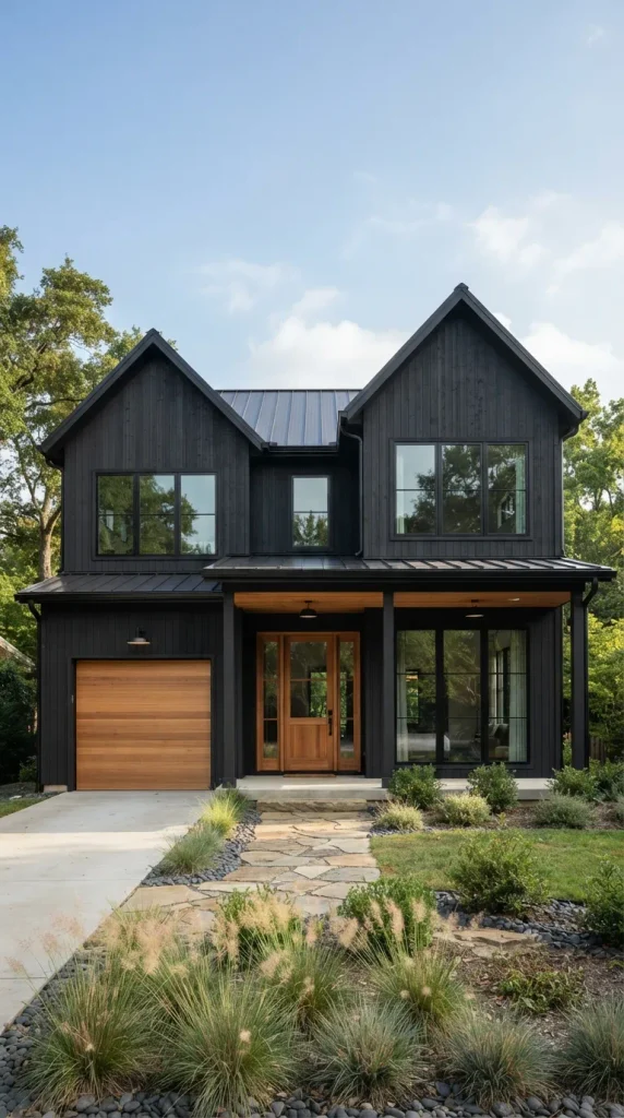
A nearly black exterior creates a striking modern appearance that can make simple architectural forms feel sophisticated and intentional. The key to keeping such a dark palette welcoming is introducing warm materials, particularly natural wood. A cedar front door, timber porch ceiling, wood garage door, or vertical siding detail can break up the darkness and create tactile contrast. Large windows are especially effective because their reflective surfaces provide visual relief across the dark façade. This palette suits modern cabins, contemporary farmhouses, minimalist homes, and angular architectural designs. Keep the surrounding landscaping relatively restrained so the house remains visually strong without becoming disconnected from its natural setting.
17. Pale Gray With Cedar Accents

Pale gray and cedar create a balanced combination of cool neutrality and natural warmth. The gray provides a clean background, while cedar adds texture through porch ceilings, garage doors, shutters, beams, or entry doors. This pairing works exceptionally well on modern farmhouse, Craftsman, Scandinavian-inspired, and contemporary homes. Instead of using bright white trim everywhere, consider a slightly warmer white or a tonal gray to maintain the sophisticated appearance. Green landscaping can soften the palette further, while dark bronze hardware adds small points of contrast. The result feels modern without being overly stark and natural without becoming rustic, making it a versatile option for homeowners who want a refined but approachable exterior.
18. Deep Teal With Soft White Trim

Deep teal combines blue and green into a rich exterior shade with considerable personality. It can make a cottage, bungalow, or contemporary home feel distinctive while remaining grounded in natural color. Soft white trim is useful for defining windows, porch posts, and rooflines, while a warm wood door provides an inviting focal point. Teal looks particularly attractive beside natural greenery because the green undertones visually connect the façade with plants and trees. Avoid pairing it with too many competing accent colors; the richness of the wall shade already provides visual interest. A charcoal or medium-gray roof can complete the composition without introducing excessive contrast.
19. Mushroom Brown With Cream Trim
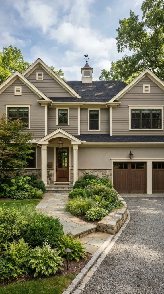
Mushroom brown is a sophisticated earthy neutral that sits between beige, gray, and soft brown. It can give an exterior a grounded appearance while avoiding the dated feeling sometimes associated with traditional brown paint. Cream trim provides gentle contrast, particularly around windows, doors, and porch details. This combination works well with stone foundations, dark roofs, natural wood doors, and mature landscaping. Mushroom tones are especially useful on homes where you want the paint to complement rather than overpower existing natural materials. Because this color family can contain different gray, taupe, or beige undertones, compare several samples beside the home’s permanent stone and brick before making the final selection.
20. Soft Black With White Windows
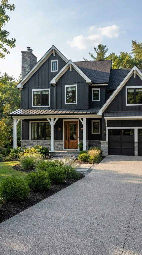
Soft black provides the drama of a dark exterior while offering slightly more visual softness than an absolute black. When paired with white window frames and restrained white trim, it creates a graphic architectural look that works particularly well on modern farmhouses, cottages, and contemporary renovations. A natural wood front door can introduce warmth, while gray stone or concrete elements provide subtle tonal variation. The combination is especially effective when the home has clean lines and relatively simple forms because the strong contrast emphasizes the architecture. If the property has extensive afternoon sun, test the paint carefully and consider the manufacturer’s recommendations for dark exterior coatings to ensure the selected product is appropriate for the surface.
21. Warm White With Natural Stone
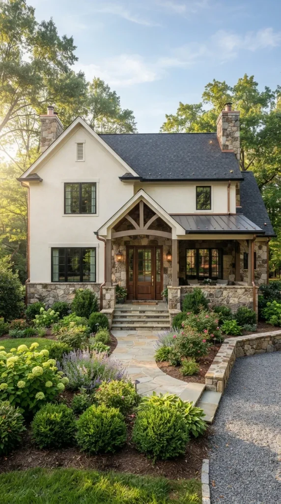
Warm white paired with natural stone creates a timeless exterior that feels refined without appearing overly formal. Use a creamy white across siding, stucco, or painted masonry and allow stone around the foundation, porch, chimney, or entryway to provide natural texture. The stone can contain several related colors, helping connect the exterior to the roof and landscaping. A medium-brown or walnut door adds warmth and creates an inviting entrance. This palette suits traditional, farmhouse, cottage, transitional, and European-inspired homes. To avoid a flat appearance, vary textures rather than adding numerous paint colors. Smooth painted surfaces beside irregular stone create enough contrast to make the façade visually interesting.
22. Moody Blue With Charcoal Trim
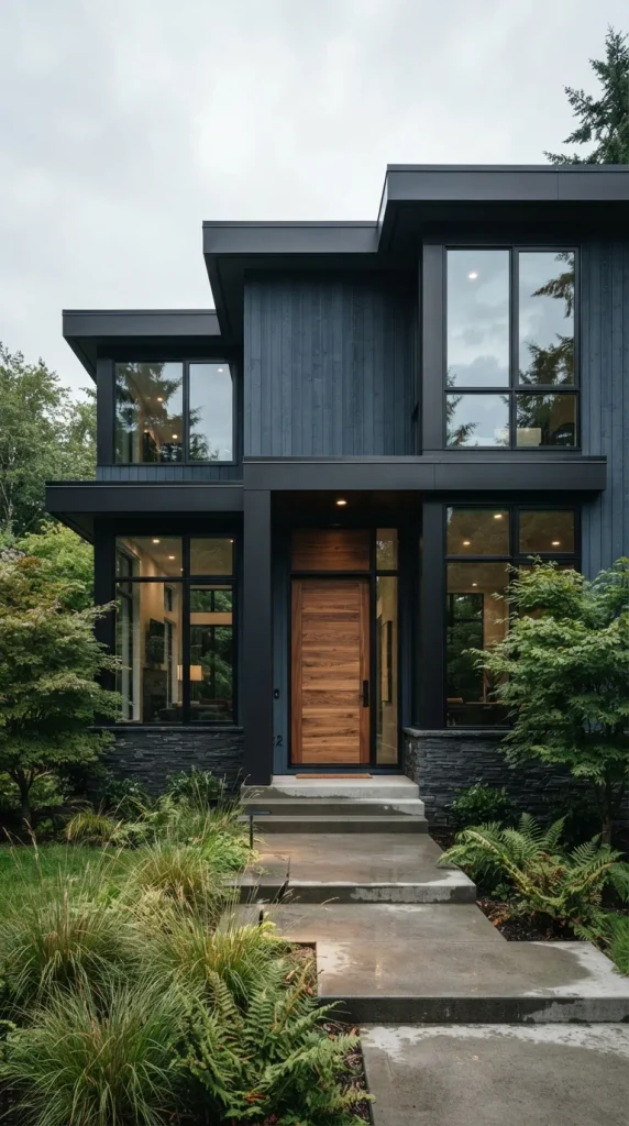
A moody blue exterior provides depth and sophistication while remaining more colorful than a standard gray or black façade. Pair a deep desaturated blue with charcoal trim around windows, doors, and rooflines for a tonal look that feels contemporary and cohesive. A warm wood door can introduce the contrast needed to make the entrance welcoming. This palette works particularly well on homes with large windows, simple roof forms, or modern siding profiles because the deeper colors emphasize clean architectural lines. Keep other exterior accents restrained, using black, charcoal, bronze, or natural wood rather than several unrelated colors. In changing daylight, the blue can reveal subtle gray undertones that give the façade added dimension.
23. Soft Yellow With White Trim
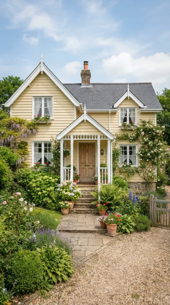
Soft yellow can give a home’s exterior a cheerful character without looking overly bright when the correct muted shade is selected. A buttery or pale yellow works particularly well on cottages, traditional homes, farmhouses, and smaller properties where warmth and charm are priorities. White trim around windows, doors, porch railings, and architectural details creates a fresh contrast. A dark gray roof and natural wood door can ground the lighter palette and prevent it from feeling too delicate. Landscaping with green shrubs and simple flowering plants complements the yellow naturally. Avoid highly saturated yellow on large exterior surfaces unless the architecture and surrounding environment can support the intensity, as strong colors become considerably more noticeable outdoors.
24. Two-Tone Gray and White Exterior
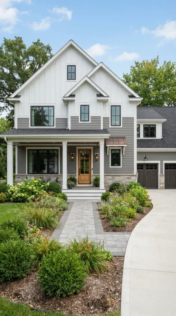
A two-tone gray and white exterior allows homeowners to emphasize architectural sections without relying on a large number of colors. Use a medium or deep gray on the primary siding and reserve white for trim, gables, porch elements, or selected upper sections. This creates visual hierarchy and can make the home’s proportions easier to read from the street. A natural wood or black front door can serve as the final focal point. The palette is suitable for modern farmhouse, transitional, ranch, and contemporary architecture. When planning the placement of each shade, follow existing structural divisions such as rooflines, porches, and gables instead of dividing the façade randomly. This produces a deliberate and professionally finished appearance.
Conclusion
Choosing among these exterior house colors ideas becomes much easier when the entire façade is considered as one connected composition. The siding or primary paint color should work with permanent elements such as the roof, brick, stone, windows, and driveway, while trim, doors, and landscaping can provide controlled contrast. Light neutrals such as warm white, beige, taupe, and soft gray create timeless foundations, whereas navy, forest green, charcoal, teal, and deep blue offer stronger personality. Natural wood and stone are particularly useful for adding warmth and texture to both light and dark palettes. Before committing to a full exterior repaint, test large samples on different sides of the house and observe them during morning, afternoon, and evening light. A carefully balanced palette can enhance architectural details, complement the surrounding landscape, and give the entire property a cohesive appearance for years to come.


